The Cincinnati Reds are the oldest professional Major League Baseball team created in 1876. They currently play in the National League Central division where they play 162 games a season, of which 81 of them are home. We were tasked with designing a mobile website that focuses on the functionality of booking a ticket online to a game.

The goal was to recreate a mobile set of flows for booking a ticket online to a home Cincinnati Reds game.
The target user was someone who is searching online to book a ticket to a home Cincinnati Reds game.
Competitive Analysis
Interviews
User Persona
Persona
User Flow
Wireframes
Prototype
UI Designs
Style Guide
Responsive UI Design
UI Kit
For booking sports tickets online there are clearly companies who lead the way. I began researching these companies and identified their strengths, weaknesses and pain points when booking a ticket online using their website. One common weakness these companies all had was too much information on the page.
Many pages felt cluttered and forced with as much information as possible. Another weakness was the lack of imagery. Most pages were filled with just text and whitespace. I felt imagery of the event would be important to connect the user with the actual experience they were searching to buy.
A common strength of these companies was their CTA’s. All were very clear and followed the best practices of hierarchy. Another common strength was their featured events. They highlighted events that were recently coming up that were near you without having to search for them. Below are additional research findings.

The previous research and interviews I conducted then allowed me to create a persona that represented my main demographic. My persona’s name is Cooper who is in his mid-thirties and married. He is a salesman who resides in the Tri-State of Ohio, Indiana, and Kentucky. Cooper’s main goal when purchasing a ticket online to a Cincinnati Reds game is to get the best deal for his money and seating choice.
Since Cooper usually does not book in advance, a quick and easy checkout process is important so he can get his tickets on time even if he is late and the event is coming up soon. Cooper also likes to have everything accessible on his phone. Since he basically always has his phone on him it’s easy to store his tickets on there so he’ll never lose them and have them available to be able to get in the game with them.


After completing all of my research I can start my final step for planning, creating a user flow. A user is the pages and decisions a user would take when given a certain task to complete.
I kept the user flow of booking a ticket online as quick as possible to create a painless process for the user. I only included the necessary pages to complete the task.
To start out I created some initial wireframes on paper. I created two versions for desktop and a responsive set for mobile. My goal was to create wireframes that were not cluttered and focused on the recent upcoming games and the ability to view all tickets.


I chose the wireframes that highlighted the option to view all tickets first and then the most recent upcoming games below that. With my wireframe direction chosen, I then was able to start the process of developing low-fidelity wireframes in Figma for the entire purchase process of booking a ticket online to a home Cincinnati Reds game.


With my low-fidelity wireframes done, I conducted my first round of usability testing with the prototype I created. Below I told my participants that their goal was to book tickets for them and three of their friends for a game in June in the outfield.

With these high-fidelity wireframes created I then conducted another round of usability testings with a new prototype. Below is a summary of my findings.
The text was too small and hard to read in some places
Fill form boxes were also too small to click
The date of game on the checkout page was not big enough for reinsurance when purchasing
Too much scrolling when searching for future games month or two ahead
”Instant Download” and “App” was desired more than ticket info they’ve already seen
The logo was too big
Didn’t know where they were in the process of purchasing the ticket
Ticket number availability was too small
Since I was recreating a current brand the logos, colors and images were already set. So for the style guide/UI kit I chose new font for the headings and body text.

With the findings I discovered from my low-fidelity usability testing, I created hi-fidelity wireframes with the changes to fix the problems from my low-fidelity wireframes.


With these high-fidelity wireframes created I then conducted another round of usability testings with a new prototype. Below is a summary of my findings.
PARTICIPANT 1
Kept waiting or looking for a search option to choose four tickets wanted
Filter option on section and seating selection page was too small or hidden
Did not understand the ticket number availability text
PARTICIPANT 2
Also did not understand the ticket number availability text
Also, the filter option on the section and seating selection page was too small or hidden
Did not understand how to save her edits to her personal information overview page
PARTICIPANT 3
Did not know where to click to purchase tickets from seat selection page
Did not notice where the selected seats were highlighted in seat selection page
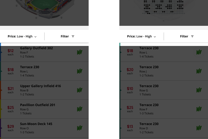
One way I fixed the filtering option was by creating a lightbox page that the user would be taken to after selecting a game. Here the user can either select how many tickets and price range they want to search for. Or the user can bypass this option and just close the lightbox at the top right and be served all tickets available.

After the user either uses the filter lightbox or bypasses it, they can either click the filter option to then use it or make changes to their original selections. To make the filter option easier to notice I designed the “Price: Low-High” and “Filter” bar as a fixed state so the only thing that will scroll is the section and seat selections below.
To keep the user updated on where they were in the purchase process, I added a status bar at the top. My goal for this is to create a sense of trustworthiness and comfortability for the user so they do not feel lost in this process.
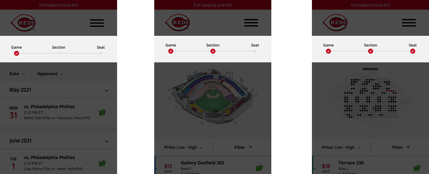
Before if a user wanted to book a game in a month or two at a future date they would have to keep scrolling till they got there. Therefore I included accordion arrows for each month so if the user wants to see games two months in advance they do not have to scroll as much to get there.

When my users ended their user tests I asked them what was the most important thing on the confirmation page was to them. All my users explained that the instant download and mobile ticket feature was. Therefore I moved these features above the ticket info making it first for users to see and access.

Looking back there are always things that I would have done differently but overall I think my new online booking process eliminated pain points and created an easier flow for users to book a sports ticket to a Cincinnati Reds game.
Habits of users booking things online can be related to many other situations when deciding what UX elements to create or not. Overall this was a very fun and interesting project for me. This is a useful tool I can add to my skill set.